A Sketch for a new Distribution Sketch
04 Oct 2018About three and a half years ago I came up with a clever trick for accurately approximating and tightly bounding a cumulative distribution in a rather small data structure. It’s high time that I blogged about it! In this post I’ll talk about the problem space, my technique, the potential benefits of my approach over other approaches, and ways to improve in the future.
Percentiles and Cumulative Distributions
A common way of summarizing a stream of numerical values is by talking about the value at a given percentile. For instance when talking about how long a web page takes to load, you might take a sampling of the loading times:
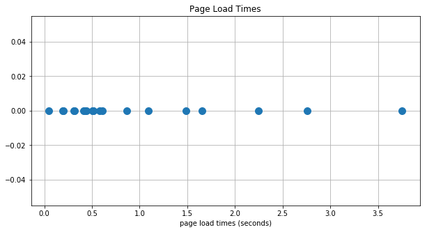
And you can then determine the 50th percentile loading time by finding the value where 50% of the data points are on the left and 50% are on the right. More generally, you might be interested in some other percentile, like the 95th percentile page loading time. You would find this in a similar manner by identifying the value where 95% of the points are to the left and 5% are to the right.
But counting dots on a graph is a bit cumbersome. So instead, to answer the above question for any percentile you can create a cumulative plot of the data.
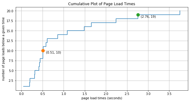
In this plot for every data value received (plotted along the x-axis) we increment the y-value by one. You can read a given point on this plot as “number of page loads below a given load time”. For instance, the orange point in this figure tells us that of the 20 page loading samples that we’re looking at, there are 10 page loads before with loading times of 0.51 seconds or less. And since 10 is half of 20, then we can also very roughly say that the 50th percentile time is 0.51 seconds. Similarly we can say that the 95% of the load times (19 out of 20) fall below 2.76 seconds.
As an improvement on this plot, we can scale the y-values to lie between 0.0 and 1.0 and then we can read the percentiles off directly. This view of the data is called an empirical distribution function
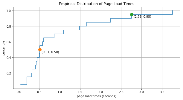
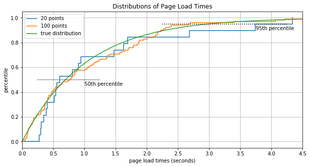
Obviously with only 20 data points we can’t really expect our estimate of the percentiles to be terribly accurate. But as we increase the number of data points the empirical distribution converges to the true distribution.
The Problem Space - and a Clever Observation
As you can see, the empirical distribution can be used to extract lots of useful information about the value stream it represents. However we need a lot of data before the empirical distribution is all that accurate. It seems likely that we can find our selves in a situation where we can’t possibly store all of the distribution data in memory. For example what if we’re working for Google Analytics and we want to know page load time distributions not just for one page but for every page that uses GA. That’s definitely not going to fit that in RAM!
So let’s see if there’s any way to “responsibly” throw away some of the data. We want to keep the information that accurately describes the distribution, but we are willing to drop information that carries unnecessarily precise details. In order to see how we might do this, take a look at the following cumulative plot of loading times.
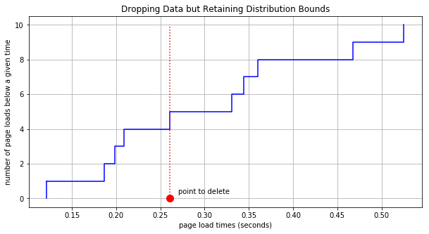
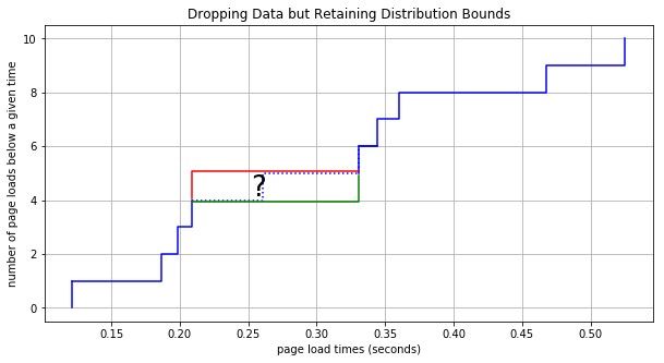
Take note of the red point that indicates a 0.26 second page load time. What if we chose to forget exactly what the page load time was. What if we said “I don’t know when the loading time was, but I know it was somewhere between the previous point at 0.21 and the next point at 0.33.” Under this assumption we can remove the data point and even though we no longer know what the true cumulative distribution is, we can at least still bound it as shown here:
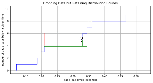
Let’s say we then want to similarly forget the subsequent data point at 0.344. The bounds would be extended in a similar way:
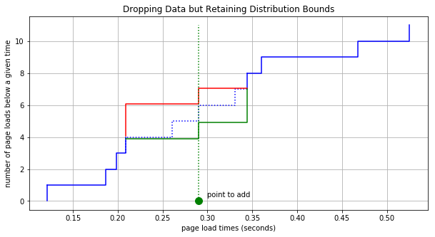
By now you can see that we can keep removing data points and although we do lose information about the distribution, the resulting bounds are still guaranteed to contain the distribution. It might seem that we are throwing away too much information but consider the following points. First, there’s nothing to stop us from adding in new data as we get it. So as we are removing data in one respect, we will be getting new data that will help us better understand the distribution. Adding a point to this new bounded cumulative distribution is simple. For example, if a new page load time came in at 0.29 seconds then all we have to do is shift up the lines in the plot after 0.29 by 1, like so:
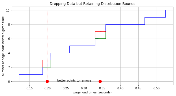
The second point to consider is that we get to choose which data points we remove. Refer back to the plots above where we’re removing points. If you think for a bit (homework exercise for the reader) it’s easy to determine how much additional area is added between the distribution bounding lines if a particular data point is removed. Therefore, if a data point must be removed, then why not always remove one that adds the least area within the bounded region. In the plot below we remove the two best points for minimizing the growth of the cumulative bounds. Compare this to the plot above and notice how much less the area within the bounds increases when we choose the best points.
The Algorithm
A data sketch is an algorithm and/or data structures that collects approximate summary information of a very large data set while maintaining a very small memory footprint. (If you want to learn more about data sketches, then check out this resource that I just found!) With the above details in mind, we have everything we need to build our own data sketch for modeling the distribution of a large set of streaming data. I will refer to this as the Distro Sketch.
Here it is in pseudo-code:
list_of_points = []

max_num_points = 300  # or whatever we choose

for value in stream_of_values:
    insert_new_point(value, list_of_points)
    if len(list_of_points) > max_num_points:
        point = get_lowest_impact_point(list_of_points)
        remove_point(point, list_of_points)
It looks almost trivial at this level of abstraction, so let’s flesh out some of the details and a get a better sense of what is going on.
First, each “point” in this list_of_points contains 3 things:
- the value (e.g. 1.23 seconds)
- a lower bound on the distribution increment
- an upper bound on the distribution increment
Note that the bound values stored in each point are bounds upon the increment rather than bounds of the absolute value of the cumulative distribution.
insert_new_point simply creates a new point and inserts it into the proper location in the list_of_points. The point is initialized with the value at hand and with both the lower and upper increment bound both set to 1. As points are added to the plot that are added in order according to their value.
get_lowest_impact_point finds the point that will contribute the least area to the distribution bound if removed. This is calculate as
additional_area = \
    (point.value - point_to_the_left.value) * point.upper_bound
    + (point_to_the_right.value - point.value) * point.lower_bound
Finally remove_point deletes the point from the list and attributes the increment bounds to the neighboring points like so:
point_to_the_left.upper_bound += point.upper_bound
point_to_the_right.lower_bound += point.lower_bound
At any point in time, if you want to plot the cumulative distribution bounds then all you have to do is iterate through the list_of_points and accumulate the low and high bound increments. For accurate estimates of the percentile for any given value or for accurate estimates of the value for any given percentile you can interpolate between the values in the sketch and the lower cumulative bounds of the distribution. (We’ll demonstrate this below.)
And that’s it! Obviously we have to think carefully about performance. For instance, in several places above we refer to the left or right points, so it’s a good idea to implement this as a doubly linked list. But we also need fast inserts, which is why I was so interested in the skip list data structure a couple of weeks back.
If you would like to see the final python implementation then please check out the jupyter notebook I put together for this post. I still consider this to be a toy implementation as there is much to be improved.
The Distribution Sketch in Action
Let’s watch the distribution sketch in action. First we need a distribution to draw from. I chose a mixed gaussian distribution with two peaks, one at -10 and one of the same size at 10. They have a standard deviation of 1 so there is a significant dead space between the two peaks. This provides an interesting test case because we would like to have accurate medians, but the median in this case occurs where there is no data provided. Let’s see how our distribution sketch works with a sketch size of 20 points (very few!) and a series of 49,000 points.
In this video the red line is the upper bound, the green line is the lower bound, and the blue dashed line is the true distribution. The first 50 points are shown one at a time. As you can see, the bounds and the true distribution overlap at first, and then at 20 values you can start to see holes opening up. Referring to the title in the video, you can see that after the 50th point we speed up the video - 10 value insertions per video frame, then 100, then finally 1000 values per frame.
Notice that although the bounds grow, they remain conservative and the points Distro Sketch are reasonably well distributed. For example half of the points are to the left of the median and half are to the right. Also the shape of the “boxes” formed by the distribution bounds are reasonable in that they are short and long in places where the empirical distribution is flat, and they are tall and narrow in places where the slop of the distribution is high. So it seems that, for 20 points, we are efficiently encoding the bounds of the empirical cumulative distribution. Let’s dig in.
Benefits of the Distribution Sketch
There are lots of interesting advantages to the Distro Sketch.
Accuracy
Despite throwing away the great majority of the data from the stream of input values, the sketch can be used to reconstruct the original distribution with very high accuracy, especially at the extremes of the distribution where we are often most interested.
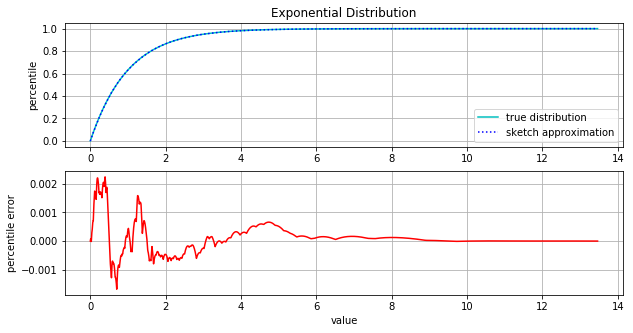
The following figure has two plots. The first compares the true cumulative distribution function with the sketch approximation. Here we’ve used a sketch of size 100 and we have drawn 100,000 data points from an exponential distribution (lambda = 1). As you can see, there is no visible difference in the actual and approximate distributions. In the second plot we show the percentile error. Here we see that the percentile error remains quite low. At the max error, we’re only 0.2% off and the percentile error gets significantly smaller in the long tail of the distribution.
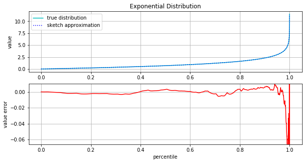
Typically though, we want to answer questions about what value we see at a particular percentile. For example regarding page load time we might ask “What is the 95th, 99th, and 99.9th percentile page load time?”. The following figure provides some insight about our ability to answer questions like this. Again we have two plots. The first is the percent point function (PPF) which is the inverse of the cumulative distribution. It answer the question “For a given percentile, what is the value?” Here again the top plot compars the true and approximate functions and again the difference is indiscernible. The second plot shows the error between these two functions. The error is very small for most of the distribution. For instance at the 90th percentile we see an error of less than 0.01. Considering that the 90th percentile value of the distribution is about 2.5, we’re only about 0.4% off.
Let’s zoom in on the more extreme portions of the distribution greater or equal to the 99.9th percentile.
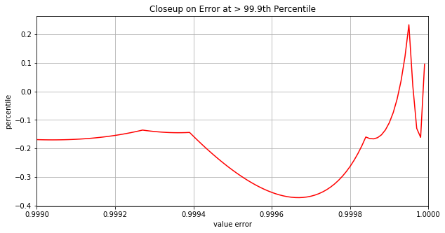
We see that all the way up until the 99.94th percentile the absolute error is less than about 0.2 - not bad considering that the 99.94th percentile value is 7.42. And the worst we ever see is 0.37 past the 99.96th percentile.
Flexible and Assumes No Prior Knowledge
The Distro Sketch has some interesting properties that make it naturally quite flexible and accurate while using a small amount of memory. Namely, when removing a point, we find the point that, if removed, will contribute least to increasing the area within the distribution bounds. This has several implications.
First, when the points are spaced further apart, then removing them is more expensive. Therefore the distribution sketch naturally prefers to keep points that are in the less dense areas of the distribution. This has the obvious benefit of retaining extra accuracy in the long tails of distributions or in “dead” areas between peaks in multimodal distributions. This behavior is most pronounced at the extrema of the distributions because the maximum and minimum point are never removed.
Second, as a corollary to the above statement, points in dense areas are preferred for removal. As points are removed, their low and high increments are distributed to neighboring points. Soon certain points in dense areas of the distribution have accumulated so many increments from their removed neighbors they they become expensive to remove. These points emerge as “anchor points” which are rarely replaced as new values arrive. This can be beneficial in that the sketch converges quickly to anchor points that adequately capture the distribution. But this might also have negative side effects if the sketch converges upon these anchor points too early and isn’t able to adapt as the rarer points come in at the extremes of the distribution.
The natural dynamic to keep data in sparse areas and drop data where it is overly abundant makes it possible to accurately capture a distribution with no prior knowledge of the distribution. We don’t have to specify “this is a normal distribution, fit it as best as you can”, and we don’t have to specify whether the distribution has a long tail to the right or the left. We can even have multi modal distributions that incorporate dead regions or even esoteric things like a mixture of continuous and discrete random variables.
Parallelizable
The sketch presented here is quite amenable to parallel construction. If the data is split into several different machines then Distro Sketches can be build for each split and then combined together by simply sorting the internal skip lists together. Calculating bounds and interpolating percentiles is then no different and the accuracy is, if anything, improved. This does however mean that the size of the sketch is increased by X times where X is the number of splits of the data.
Easily Understood
Perhaps one of the best aspects of this approach is that it is so easy to understand. For practical reasons this can be important! Application engineers are rarely of the same mindset and depth of understanding as a mathematician or a CS researcher. Nevertheless it is the application engineers who will be implementing the Distro Sketch. It is ideal to have very few parts that might be misinterpreted and incorrectly implemented. The most complex idea introduced here is the notion of an empirical cumulative distribution. We don’t even touch on more complex domains of statistics or probability. What’s more, the output of this sketch is easy to interpret because we are dealing with exact bounds upon the empirical distribution rather than some probabilistic information about the true value of the distribution.
Improvements for the Distribution Sketch
I have probably spent all of 2 week thinking about this idea. I’m sure there are plenty of places that this can be improved. Here are a couple!
Speed
Because of the skip list implementation that I’m using, each new point added to the Distro Sketch involves 6 skip list inserts and 6 deletes (read the code for details). This give the CPU a pretty good workout. I think the situation can be improved considerably by batching inserts to the sketch rather than doing them one at a time. In that scenario you will have to sort each batch, but this is much better than finding the proper location for 6 point for each point added to the Distro Sketch.
Improving Accuracy
The accuracy I’ve demonstrated is sufficient for many applications, but it can be improved. There exists a bad dynamic involving early convergence to anchor points (see the discussion of anchor points in the Flexible and Assumes No Prior Knowledge section above). Once the anchor points are fairly stable then consider what happens when a new value is added at an extrema, e.g. a new max value in the long tail of an exponential distribution. In this case you can’t remove the extrema point because, being the last point, the area that would be added to the bounds is infinite. So you have to chose one of the existing points to remove. This is damaging to our distribution bounds no matter where the point is removed, but it is particularly damaging when the point chosen is the point immediately neighbor to the new extrema because we are often interested in the details of the distribution near the extrema.
One possible fix here is that in the rare cases where we receive a new extrema, we skip the normal point removal step and just allow the sketch to increase in size. In doing this we will not be required to remove one of the existing anchor points. Implementing this was a quick change in (my code) and in trying it out, preliminary results show that this technique may help improve the situation as anticipated.
Another possible improvement is, again, to process the values in batches. By processing values one at a time you quickly run into the situation that the best point to delete is the point that you just added because it has an increment of merely 1 while it’s neighbors have much larger increments. When processing in batches, individual points get an opportunity to clump together with other individual points, and we may be able to choose a better point to remove. This will delay the convergence to anchor points and ensure that the points in the sketch are more evenly spaced.
Finally, the cost function that controls which point is removed is pretty generic (refer back to The Algorithm section). We can modify the behavior significantly by penalizing distance between points differently than point increments. We can also add in other features to the cost function, such as how long the point has existed.
Conclusion
So far, the Distro Sketch has been a fun thought experiment. But I do think that it could have utility in real applications. As I’ve laid out above, the sketch is easy to understand and plenty accurate for most purposes.
I would like to have input from you! Is this sketch novel? I’m torn here. Is the idea beautifully simple, or is it overly simplistic and naive? Perhaps this idea already exists and I just haven’t run across it yet. If so then please point me towards more information. And if the Distro Sketch is a new idea, then would you be interested in helping me bring awareness to it? I would be interested in working with someone who wishes to implementing the Distro Sketch in their own project. I would also be interested in working with someone that to publish this idea in an appropriate publication, academic or otherwise.
Did you enjoy reading this? Help me get the word out!